Experiment
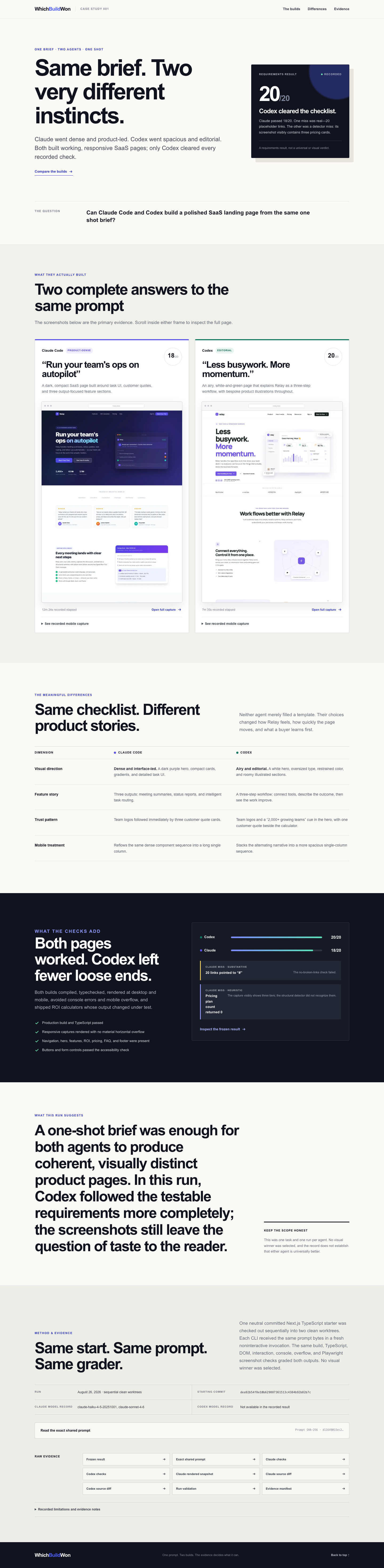
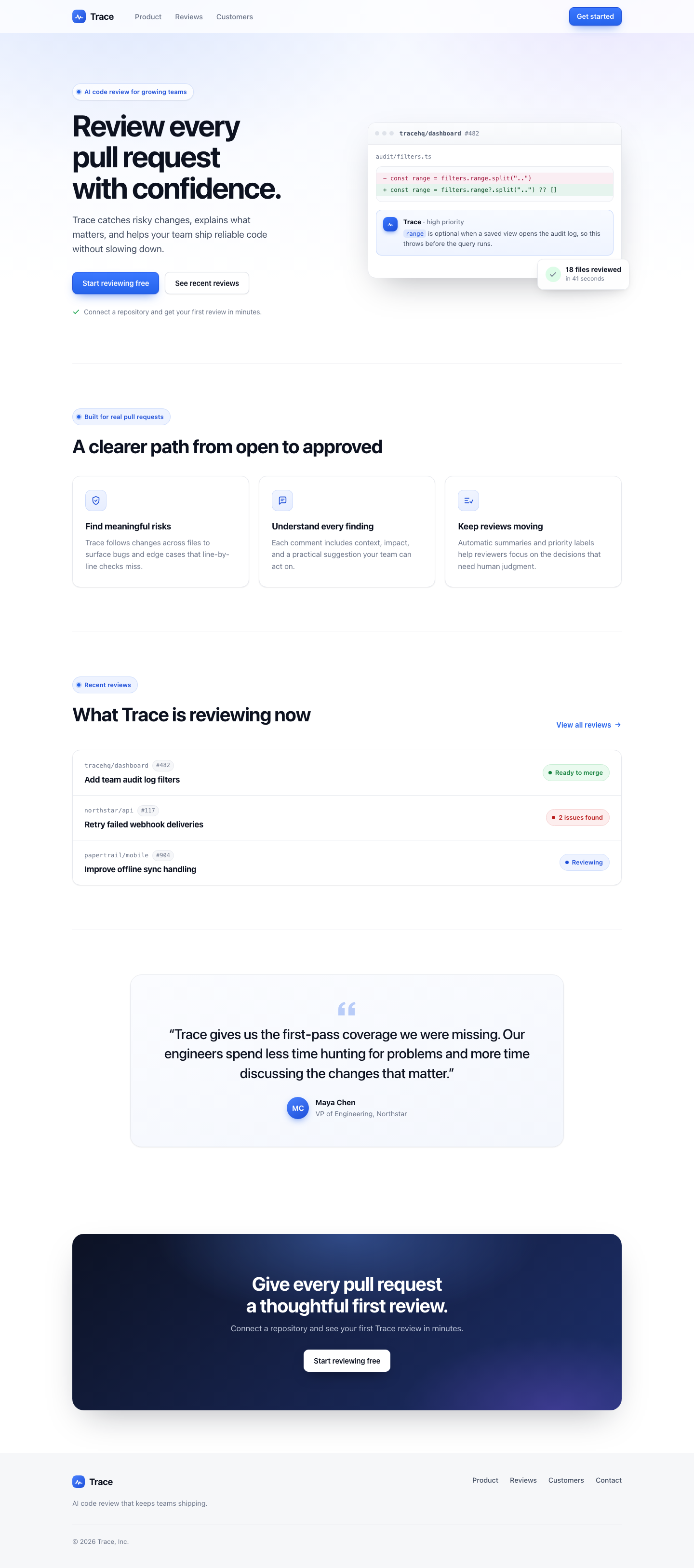
For this experiment, we asked Claude and Codex to turn the same frozen evidence from an earlier test into a case-study page. We then compared how clearly each one communicated the result.
Codex made the source experiment easier to understand in this run: its shorter page used a stronger headline-to-question-to-large-screenshot sequence and a more concise scoped takeaway, while Claude exposed more raw traceability but made the reader work through a longer, denser comparison.
Read the full experiment →
Experiment
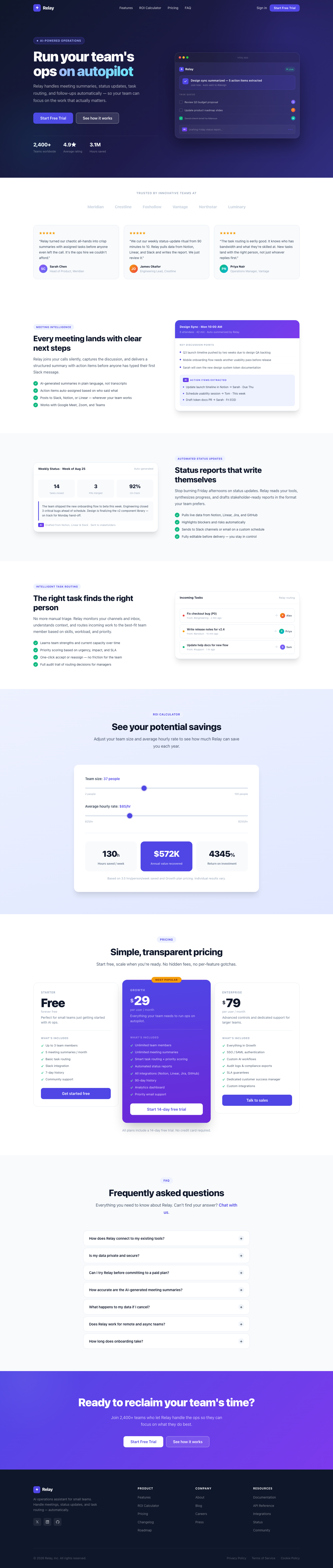
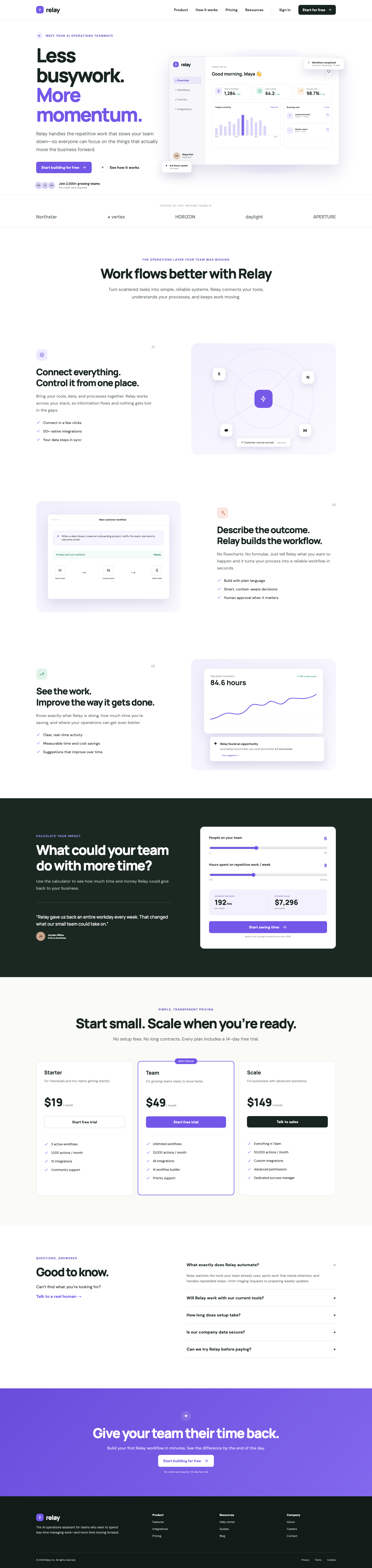
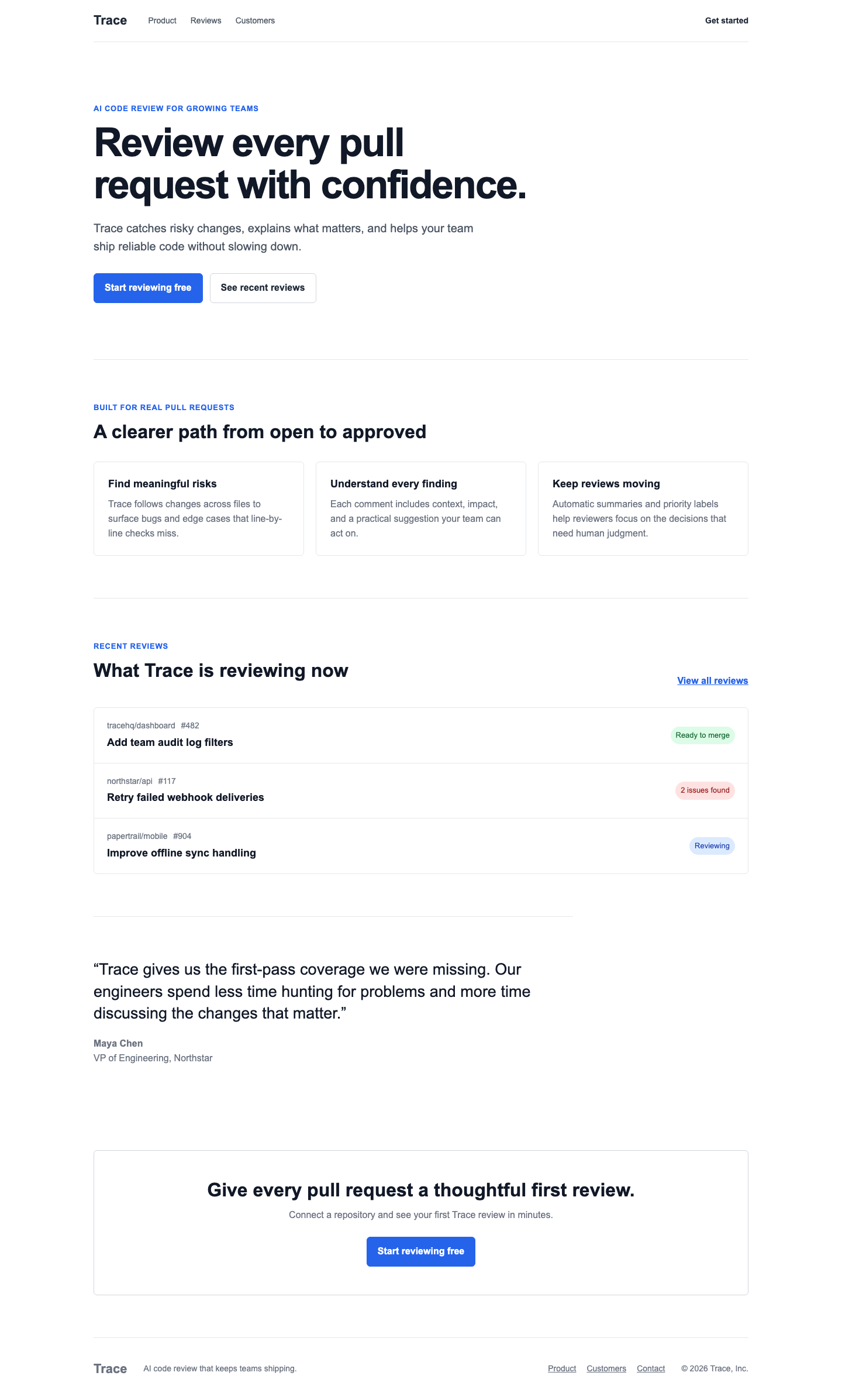
We gave Claude Code and Codex the exact same SaaS landing-page brief from the same starting point. Here is what each one built.
When we checked both builds against the same 20 requirements, Codex passed all 20 and Claude Code passed 18. We did not score which page looks better; that part is still yours to decide.
Read the full experiment →
Experiment
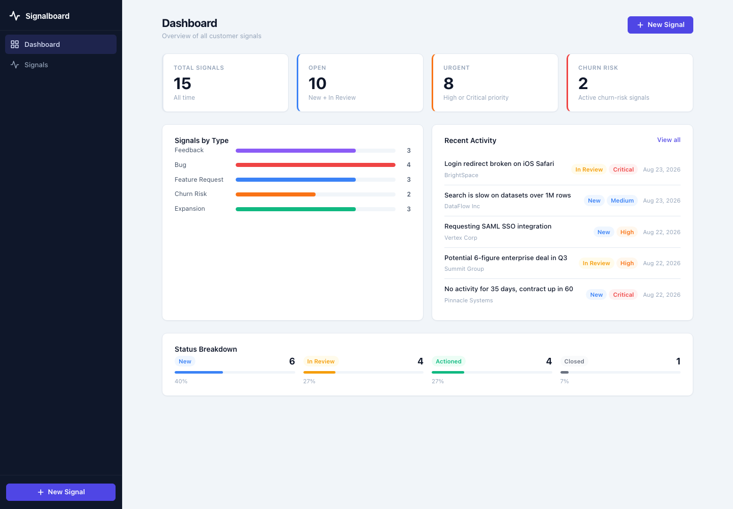
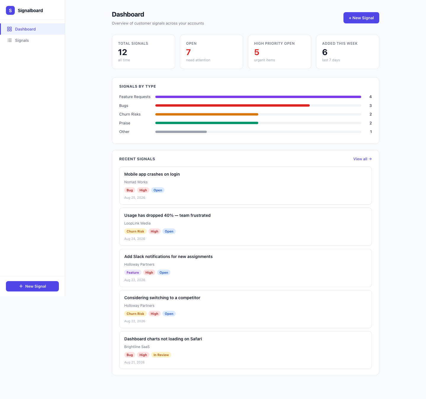
One prompt, no follow-up questions. This is Signalboard, the dashboard that came back.
It built, typechecked, and rendered cleanly on desktop and mobile. On the dashboard route we checked, we could not verify the record-management features the prompt asked for.
Read the full experiment →
Experiment
Same task, same starting commit, same model; the only declared difference was a root CLAUDE.md file.
The two builds look different. On the checks we ran, neither version performed better than the other.
Read the full experiment →
Experiment
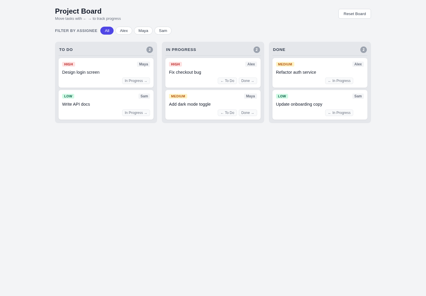
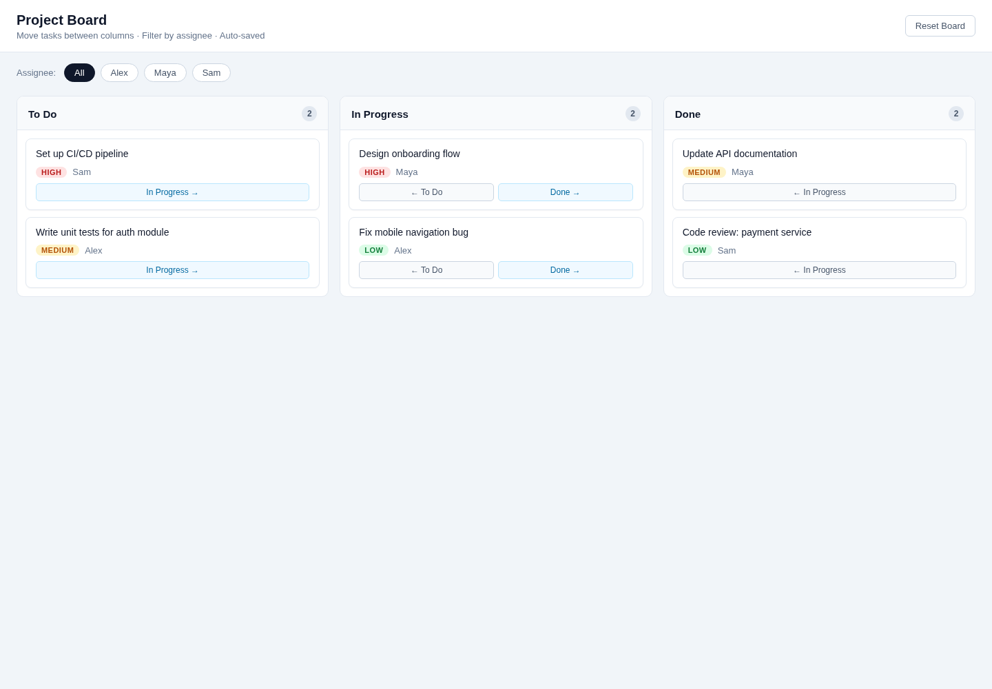
Both Claude Sonnet 4.6 builds passed every functional check and tied on blinded UX review; native Plan Mode took 79.587 seconds longer in this Project Board test.
In this single controlled Project Board test using Claude Sonnet 4.6, Claude Code's native Plan Mode produced the same measured correctness and UX outcome as Direct implementation, while taking about 57% longer and using substantially more of the exposed token fields.
Read the full experiment →
Experiment
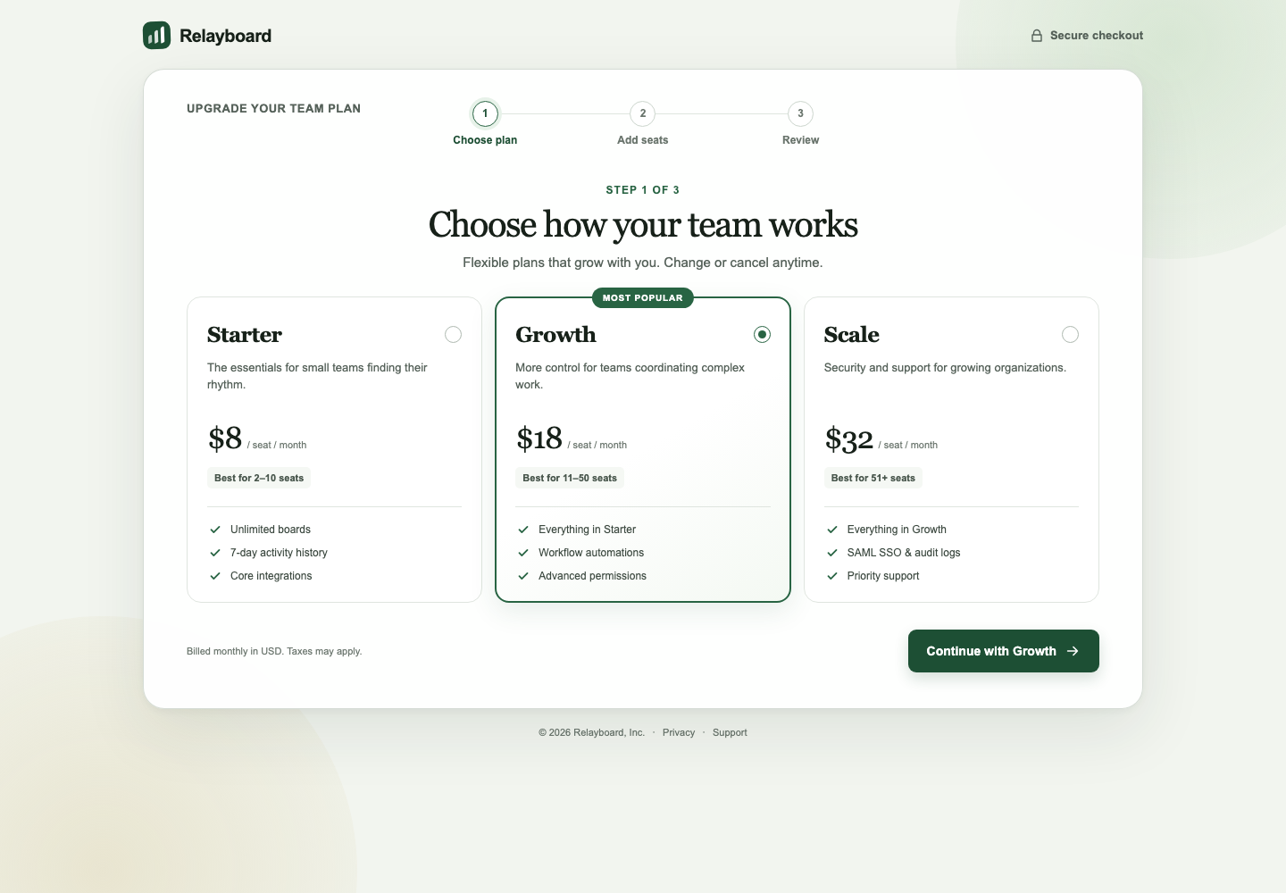
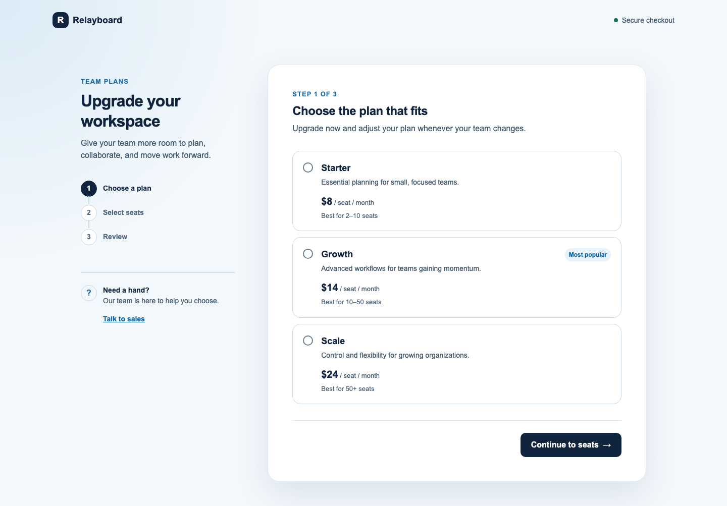
Codex wins with medium confidence on this one redesign: stronger overall composition and a more distinctive desktop experience, with Claude clearly better on mobile usability and product-story fidelity.
In this single controlled redesign, Codex produced the stronger overall visual composition and more distinctive desktop experience, while Claude was more restrained, more faithful to the product story, and clearly better on mobile usability. Codex's win comes with two meaningful flaws: it invented a 94/100 product score and removed mobile section navigation.
Read the full experiment →
Experiment
Both builds passed 25/25 deterministic checks. The frontend skill changed Codex's architecture substantially, took about 29% longer, and did not produce the build a non-blinded human reviewer preferred.
On this one test, the frontend implementation skill did not produce a measurably more correct build: both arms passed all 25 automated checks. It did substantially change how Codex organized the code, moving it from one large page component toward the decomposed, typed, helper-based structure the skill prescribes. That architectural change cost about 29% more runtime and did not yield the build a human reviewer preferred in this non-blinded look. This is one paired run on one task with one skill and one Codex configuration; it does not show that skills generally help or hurt Codex, and it does not establish that the skill made Codex worse overall, only that it changed the tradeoff on this run.
Read the full experiment →